T he colour on your walls does more than decorate a room — it shapes how the space feels, how light behaves inside it, and how everyone who enters it reacts. Choosing the right shade for the right room is one of the simplest, most affordable ways to transform a home, yet it's also one of the most commonly rushed decisions. With a clear approach to each room's purpose and lighting, you can pick colours that feel right the moment you walk in, not just the moment you see them on a swatch.
The right colour doesn't just fill a wall — it sets the mood for everything that happens in the room.
VNC Interiors
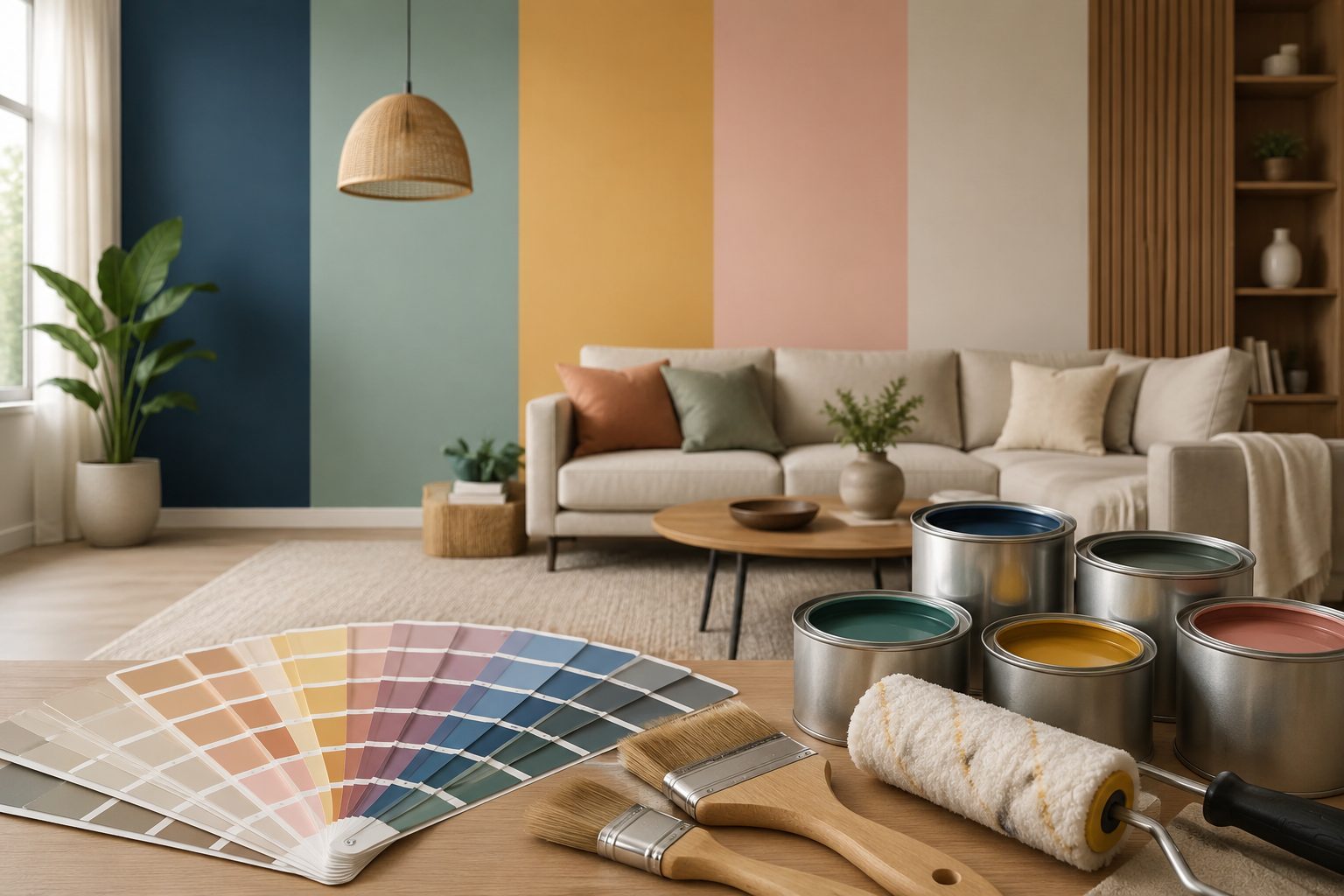
Why Paint Colour Matters More Than You Think
Colour affects perceived room size, natural light, and even mood — cooler tones recede and make spaces feel larger and calmer, while warmer tones advance and make spaces feel cosier and more intimate. Before picking a colour because it looks good in a photo, it helps to think about how each room is actually used, what time of day it gets the most light, and what feeling you want to walk into.
1. Living Room: Colours That Welcome and Impress
The living room is usually the first space guests see, so it needs to balance warmth with a sense of style. Warm neutrals — soft beige, warm greige, and muted taupe — work well as a versatile base that pairs easily with any furniture or décor style. If you want more character, a deep accent wall in navy, forest green, or terracotta on the wall behind the sofa adds depth without overwhelming the room.
For smaller living rooms, lighter tones with a hint of warmth keep the space feeling open, while larger living rooms can comfortably carry richer, more saturated colours.
2. Bedroom: Colours That Calm and Relax
Bedrooms benefit most from colours that lower energy rather than raise it. Soft blues, sage greens, and dusty lavenders are consistently associated with better rest, while muted earthy tones like clay and sand create a grounded, cocooning feel. Avoid highly saturated or very bright colours in the bedroom — they tend to keep the mind more alert, which works against the room's purpose.
3. Kitchen: Colours That Energise and Uplift
Kitchens can handle — and often benefit from — more energy than living rooms or bedrooms. Crisp whites and soft off-whites keep the space feeling clean and make it easier to spot when surfaces need cleaning, while accent cabinetry or an island in sage green, navy, or a warm mustard adds personality without competing with tiles, countertops, and appliances. If your kitchen gets limited natural light, lean towards brighter, warmer whites rather than cool, grey-toned ones, which can make the space feel flat under artificial lighting.
4. Exteriors: Colours That Define Your Home's Character
Exterior colour choices need to account for weathering, heat, and how the home reads from the street. Lighter exterior shades reflect more heat and suit Bangalore's climate well, while a contrasting colour on the main door, grilles, or balcony trims gives the façade a defined, intentional look rather than a flat one. It's worth testing exterior colours in direct daylight at different times of day — sunlight changes how a shade reads far more dramatically outdoors than indoors.
5. Understanding Paint Finishes and Sheens
The finish you choose affects both appearance and durability as much as the colour itself. Matte and eggshell finishes hide wall imperfections well and suit living rooms and bedrooms, while satin and semi-gloss finishes stand up better to moisture and frequent cleaning, making them a better fit for kitchens, bathrooms, and high-traffic corridors. Exterior paints need weather-resistant, washable finishes that can handle sun, rain, and dust without fading or peeling prematurely.
6. Testing Before You Commit
Every colour looks different depending on the room's lighting, the time of day, and the colours around it. Always test a sample patch directly on the wall — not just on a card — and view it in both natural daylight and artificial light in the evening before finalising. A shade that looks perfect in a showroom or on a screen can shift noticeably once it's on your own walls.
7. Working with the Right Painting Partner
Even the best colour choice depends on quality application — proper surface preparation, the right primer, and even coverage make the difference between a finish that looks premium for years and one that shows brush marks and patchiness within months. VNC Interiors works with India's leading paint brands through our painting dealer partnerships, giving clients access to trusted products alongside skilled application.
Why Choose VNC Interiors?
At VNC Interiors, our painting services go beyond simply applying colour — we help clients choose shades that suit their space, lighting, and lifestyle, then deliver a flawless, long-lasting finish using premium materials and experienced painters. Whether it's a single accent wall or a complete home repaint, our team handles surface preparation, colour consultation, and execution with the same precision we bring to our construction and interior projects.
Conclusion
The right paint colour turns an ordinary room into one that feels intentional, welcoming, and truly yours. By thinking through each room's purpose, lighting, and finish requirements — and testing before committing — you can avoid costly repaints and get a result that feels right for years to come.
Ready to repaint or refresh your home? Get in touch with VNC Interiors for expert colour consultation and premium painting services in Bangalore.